 Open UI
Selectlist Element (Explainer)
Table of Contents
- Background
- Use cases
- Testing out the selectlist element
- Anatomy of the selectlist element
- Styling selectlist
- Using your own markup
- Examples
- Keyboard Behavior
- Form Semantics
- Why not improve
<select> - Design decisions
Background
The <select> element does not provide enough customization for web developers, which leads them to implement their own. These implementations can lead to reduced performance, reliability, and accessibility compared to the native form control elements. More on that is in Custom Control UI.
The 2020 MDN browser compatibility report had feedback that form controls are neither interoperable nor stylable. <selectlist> will be fully interoperable and stylable.
Use cases
Customizing basic styles
This example changes the fonts and colors of various parts of the button and listbox parts of the selectlist. The existing <select> element will not incorporate these basic styles into its rendering.
<selectlist>
  <option>one</option>
  <option>two</option>
</selectlist>
<style>
selectlist::listbox,
selectlist::button {
  font-family: monospace;
  font-size: 12px;
}
</style>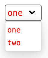
Rich content in <option>s
This example adds “rich content” inside option elements in the form of country flags. This is a common pattern on the web which isn’t possible in the existing <select> element because <select>’s <option>s only render text content.
<selectlist>
  <option>
    <img src="usa.jpg" alt="flag of USA">
    USA
  </option>
  <option>
    <img src="germany.jpg" alt="flag of Germany">
    Germany
  </option>
  <option>
    <img src="spain.jpg" alt="flag of Spain">
    Spain
  </option>
</selectlist>
Replacing the button
This example replaces the button which opens the listbox with an author provided <button> element.
<selectlist>
  <button type=selectlist>
    selected option: <selectedoption></selectedoption>
  </button>
  <option>one</option>
  <option>two</option>
</selectlist>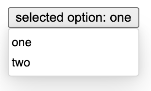
Rendering the <option> differently in the button
This example uses the <selectedoption> element with custom CSS to target it which renders the option differently in the listbox vs in the button.
<selectlist>
  <button type=selectlist>
    <selectedoption></selectedoption>
  </button>
  <option>
    ❤️ <span class=description>heart</span>
  </option>
  <option>
    🙂 <span class=description>smile</span>
  </option>
</selectlist>
<style>
selectedoption .description {
  display: none;
}
</style>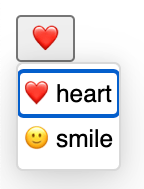
Putting custom content in the listbox
This example has a <listbox> which enables it to put arbitrary content into the listbox rather than just <option>s.
<selectlist>
  <listbox>
    <div class=container>
      <div>
        <optgroup label="1-2">
          <option>one</option>
          <option>two</option>
        </optgroup>
      </div>
      <div>
        <optgroup label="3-4">
          <option>three</option>
          <option>four</option>
        </optgroup>
      </div>
      <div>
        <optgroup label="5-6">
          <option>five</option>
          <option>six</option>
        </optgroup>
      </div>
      <div>
        <optgroup label="7-8">
          <option>seven</option>
          <option>eight</option>
        </optgroup>
      </div>
    </div>
  </listbox>
</selectlist>
<style>
.container {
  display: grid;
  grid-template-rows: auto auto;
  grid-template-columns: 50px 50px;
  grid-column-gap: 10px;
  grid-row-gap: 10px;
}
.container > div {
  background-color: lightgray;
}
</style>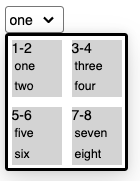
Here is another example with custom content in the listbox: codepen
Animations
This example uses view transitions to animate the opening and closing of the listbox. Link to codepen
Testing out the selectlist element
<selectlist> is currently implemented behind a flag in Chromium. To use it, enable the Experimental Web Platform features flag in about:flags.
If you encouter bugs or limitations with the design of the control, please send your feedback by creating issues on the open-ui GitHub repository. Here is a list of open selectlist bugs in open-ui.
Anatomy of the selectlist element
Because the various parts of the selectlist can be styled, it’s important to understand the anatomy of this UI control.
<selectlist>- The root element that contains the button and listbox.- button (slot) - The portion of the element which is rendered in the position of the button which opens the listbox. It should contain a button to open the listbox. If this part is not provided by the author, then
<selectlist>will automatically create one. All child elements of the<selectlist>, except<listbox>,<option>s, and<optgroup>s will be slotted into this slot. <button type=selectlist>- The button which opens the listbox when clicked. Thetype=selectlistattribute indicates to the browser that this button should open the listbox.<selectedoption>- The element which contains the text of the currently selected option. Every time that the user selects an option, the browser will replace the text content of this element with the text content of the selected option.<listbox>- The wrapper that contains the<option>(s) and<optgroup>(s). If this part was not provided by the author, then<selectlist>will automatically create one.<optgroup>- Optional element which groups<option>(s) together with a label.<legend>- Used to provide a label to an<optgroup>element. It must be the first child of the<optgroup>.<option>- Can have one or more and represents the potential values that can be chosen by the user.
Styling selectlist
Selectlist provides a variety of tools to help with styling, including pseudo-selectors for different states and pseudo-elements for different parts.
Styling parts of the control
Selectlist supports a variety of pseudo-elements to target its different parts:
::button- Targets the button slot.::listbox- Targets the<listbox>.::marker- Targets the dropdown arrow of the default supplied button.::selectedoption- Targets the<selectedoption>element.
Each of these pseudo-elements will target the default part if the author doesn’t provide their own replacement. If the author provides their own, these pseudo-elements will target the author provided part.
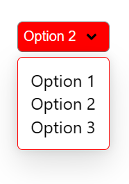
<style>
  .my-select-list::button {
    color: white;
    background-color: #f00;
    padding: 5px;
    border-radius: 5px;
  }

  .my-select-list::listbox {
    padding: 10px;
    margin-top: 5px;
    border: 1px solid red;
    border-radius: 5px;
  }
</style>
<selectlist class="my-select-list">
  <option>Option 1</option>
  <option>Option 2</option>
  <option>Option 3</option>
</selectlist>
The above example results in the following style:
:open and :closed pseudo-selectors
The selectlist element supports the :open and :closed pseudo selectors as specified by CSS here: https://drafts.csswg.org/selectors/#open-state
When the selectlist’s listbox is showing, the selectlist element will match :open, and when it is not showing, it will match :closed. Here is an example which makes the button red when the listbox is closed and green when it is open:
<selectlist>
  <button id=custombutton type=selectlist>
    <selectedoption></selectedoption>
  </button>
  <option>one</option>
  <option>two</option>
</selectlist>
<style>
selectlist:open #custombutton {
  background-color: green;
}
selectlist:closed #custombutton {
  background-color: red;
}
</style>
Using your own markup
You can further customize the control to fit your needs by providing your own markup to replace the default one, and extend and re-order the parts.
Default behavior
The default behavior of <selectlist> mimics the behavior and minimal required markup of the current <select> element. For instance, the following markup demonstrates the bare minimum necessary to render a <selectlist>:
<selectlist>
  <option>Option 1</option>
  <option>Option 2</option>
  <option>Option 3</option>
</selectlist>
When doing so, the default button, <selectedoption>, and <listbox> are created for you. As with the current <select> element, the initial <option> will be returned as the <selectedoption>.
If one wanted to create groupings of options, then the following minimal markup could be used:
<label for=ex2>My second example</label>
<selectlist id=ex2>
  <optgroup>
    <legend>Fruits</legend>
    <option>Apples</option>
    <option>Oranges</option>
  </optgroup>
  <optgroup>
    <legend>Vegetables</legend>
    <option>Carrots</option>
    <option>Onions</option>
  </optgroup>
</selectlist>
Note that with the <select> element a label attribute would have been used to provide the label for the optgroup. Being an attribute, this limited authors to using text alone to label their option groups. With the <selectlist> the <legend> element, rather than the label attribute, is how one would provide the label for the option group.
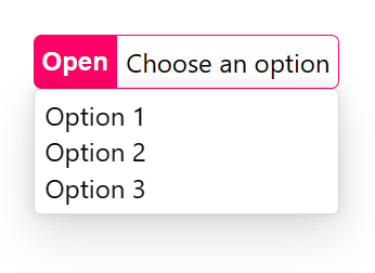
Slotting your own content
The browser uses imperative slotting to replace default parts with author supplied ones. For example, to replace the default button with your own, you can do the following:
<style>
  .my-custom-select .buttoncontainer {
    display: flex;
    align-content: center;
  }
  .my-custom-select button {
    padding: 5px;
    border: none;
    background: #f06;
    border-radius: 5px 0 0 5px;
    color: white;
    font-weight: bold;
  }
  .my-custom-select .label {
    padding: 5px;
    border: 1px solid #f06;
    border-radius: 0 5px 5px 0;
  }
</style>
<selectlist class="my-custom-select">
  <div class="buttoncontainer">
    <button type=selectlist>Open</button>
    <span class="label">Choose an option</span>
  </div>
  <option>Option 1</option>
  <option>Option 2</option>
  <option>Option 3</option>
</selectlist>
The <div class="buttoncontainer"> tells the <selectlist> to replace its default button with the contents of that <div> because it is the first child element of the <selectlist> which is not a <listbox>, <option>, or <optgroup>.
The type=selectlist attribute on the inner <button> tells the browser that this element should open the listbox when clicked. The browser will automatically apply all the click and keyboard handling behavior to this element as well as the appropriate accessibility semantics.
The above code snippet results in the following style:
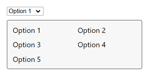
You can replace the default listbox part in a similar fashion:
<style>
  .my-custom-select listbox {
    width: 300px;
    display: grid;
    grid-template-columns: repeat(auto-fit, minmax(100px, 1fr));
    gap: 10px;
    padding: 10px;
    box-shadow: none;
    margin: 10px 0;
    border: 1px solid;
    background: #f7f7f7;
  }
</style>
<selectlist class="my-custom-select">
  <listbox>
    <option>Option 1</option>
    <option>Option 2</option>
    <option>Option 3</option>
    <option>Option 4</option>
    <option>Option 5</option>
  </listbox>
</selectlist>
The above code snippet results in the following style:
Extending the markup
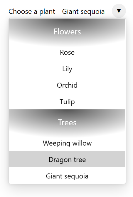
Not only can you replace the default parts with your own, you can also extend the control’s markup by adding new elements. This can be useful to augment the listbox or button with extra information, or to add new functionality.
Consider the following example:
<style>
  .my-custom-select .buttoncontainer {
    display: flex;
    align-items: center;
    gap: 1rem;
  }
  .my-custom-select button {
    border: none;
    margin: 0;
    padding: 0;
    width: 2rem;
    height: 2rem;
    border-radius: 50%;
    display: grid;
    place-content: center;
  }
  .my-custom-select button::before {
    content: '\25BC';
  }
  .my-custom-select listbox {
    padding: 0;
  }
  .my-custom-select .section {
    padding: 1rem 0 0;
    background: radial-gradient(ellipse 60% 50px at center top, #000a 0%, transparent 130%);
  }
  .my-custom-select h3 {
    margin: 0 0 1rem 0;
    text-align: center;
    color: white;
  }
  .my-custom-select option {
    text-align: center;
    padding: 0.5rem;
  }
</style>
<selectlist class="my-custom-select">
  <div class="buttoncontainer">
    <span class="label">Choose a plant</span>
    <selectedoption></selectedoption>
    <button type="selectlist"></button>
  </div>
  <listbox>
    <div class="section">
      <h3>Flowers</h3>
      <option>Rose</option>
      <option>Lily</option>
      <option>Orchid</option>
      <option>Tulip</option>
    </div>
    <div class="section">
      <h3>Trees</h3>
      <option>Weeping willow</option>
      <option>Dragon tree</option>
      <option>Giant sequoia</option>
    </div>
  </listbox>
</selectlist>
Using custom markup to wrap the list of options, the above example creates sections with their own styles and content as seen below:
Examples
You can find multiple examples of <selectlist> on our demo page.
Keyboard Behavior
The selectlist element has keyboard behavior inspried by both the existing <select> element and the Aria Authoring Practices Guide Combobox Pattern. This behavior was decided in issue 386 and issue 433.
When the listbox is closed and the button is focused:
- Spacebar opens the listbox.
- Enter submits the form associated with the selectlist if one exists. Otherwise, enter does nothing.
- The up, down, left, and right arrow keys all open the listbox without changing the selcted value.
When the listbox is open:
- Escape closes the listbox without changing the selected value.
- Spacebar is used for typeahead.
- Enter changes the selected value to the currently focused option and closes the listbox.
- The up arrow key moves focus backwards in the list of options and changes the selected value to the newly selected option.
- The down arrow key moves focus forwards in the list of options and changes the selected value to the newly selected option.
- The left and right arrow keys do nothing.
Form Semantics
The selectlist element is a form-associated element, which means that it can be used to build and submit forms just like the existing <select> element.
IDL
The following IDL is used for selectlist. Most items which are named the same as items for other form-associated elements behave in the same way.
interface HTMLSelectListElement : HTMLElement {
  readonly attribute boolean open;

  readonly attribute HTMLOptionElement? selectedOption;
  attribute DOMString value;
  [CEReactions, Reflect] attribute boolean disabled;
  readonly attribute HTMLFormElement? form;
  [CEReactions, Reflect] attribute DOMString name;
  readonly attribute DOMString type;
  [CEReactions, Reflect] attribute boolean required;

  readonly attribute boolean willValidate;
  readonly attribute ValidityState validity;
  readonly attribute DOMString validationMessage;
  boolean checkValidity();
  boolean reportValidity();
  void setCustomValidity(DOMString error);
  void showPicker();

  readonly attribute NodeList labels;
};
The selectedOption and value attributes
selectlist.selectedOption returns the currently selected <option> element. This is unlike <select> which has a selectedOptions property and returns a list of selected options because selectlist only supports one selected option at a time.
Just like the <select> element, selectlist.value returns the value property of the currently selected option.
The disabled, form, name, required, and labels attributes
These IDL attributes behave exactly as they do for other form-associated elements as specified by HTML:
- HTML spec for
disabled - HTML spec for
form - HTML spec for
name - HTML spec for
required - HTML spec for
labels
The type attribute
Like other form control elements, selectlist supports the type attribute. It simply returns "selectlist".
Validity IDLs
Like other form control elements, selectlist supports validity checking attributes and methods as specified by HTML:
- HTML spec for
willValidate - HTML spec for
validity - HTML spec for
validationMessage - HTML spec for
checkValidity() - HTML spec for
reportValidity() - HTML spec for
setCustomValidity()
The showPicker method
Like other inputs, selectlist supports the showPicker method. This method is used to show the listbox. It requires user activation.
Why not improve <select>
Instead of creating a new <selectlist> element, we could improve the existing <select> element to meet the same needs. However, there are a few problems with this (borrowed from the Custom Controls UI Explainer):
- Changing the parsing behavior for
<select>to allow other element children by default would likely break a lot of old sites that depend on the current behavior. - While it might be possible to modify the parser to change rules based on the existence of an opt-in attribute, there would be additional work to be done if JavaScript added or removed that attribute after the fact.
- The
<select>popup has the capability to break outside the browser window, and<selectlist>will not. If the author wants this capability, they will have to stick with<select>. If the author would rather have custom styling, then they should use<selectlist>. This is a big differentiation and is more than just an opt-in for styling, so havingt a separate tag name than an opt-in attribute makes more sense.
Given that we would be required to introduce something new into the platform (attribute, element, etc) to opt-in to the new behavior; we opted for a new element. This comes with the added benefit that over the years most developers that want customization of controls and components will not leverage <select> at all; akin to how developers leverage grid and flex display types for layout instead of <table> or float. Additionally, this has the potential to simplify the implementation cost since we do not have to make substantial changes to the current <select> parser